Three
DECADES
Three Decades in Colors and Shapes. A culture-historical perspective on the 1970s to 1990s with Caparol Icons. Design, colors and zeitgeist. These go hand in hand and can turn out quite differently depending on the decade and movement.
In partnership with CAPAROL ICONS
Shot on medium format film
The period between the late 1960s and 1970s is characterized by an optimistic view of the future, a time when technology and innovation promised entirely new possibilities. The 1980s were even more colorful and notably shaped by the experimental joy of the Milanese design group Memphis. Everything became even more shrill, grotesque and playful. A completely different trend emerged in the 1990s. Minimalism had its big moment.
Clear lines, glass, beige and white tones now dominated entire rooms. Three decades, three objects—dipped into fitting colors by CAPAROL ICONS. Caparol Icons embraces not only icons of color culture. The brand also combines environmental friendliness with luxurious wall design and is proven to offer the most healthy products in the German luxury interior paint market. They not only work perfectly on walls, but also on objects.
1970s—NO 100 PSYCHEDELIC
SPACE AGE
It all began with the launch of the first Sputnik satellite in 1957. The satellite was just 58cm in diameter but had a huge impact—it introduced a completely new era, marked by space exploration and space technologies, which not only promoted developments in technology but also shaped an entire design era. Although the style had already emerged in the 1950s, it had its clear peak between the years 1969 and 1975. The media hype encouraged designers to take up the round ball design. Terms such as comet or satellite were now frequently used to name specific consumer goods and the design language changed significantly.
The inspiration is obvious: shapes and even buildings that are clearly reminiscent of space travel are becoming more and more common. Buildings in the shape of satellites, everyday products in round designs reminiscent of space helmets and pendant lamps in space capsule shapes now determined a very specific direction of interior design. Everything became more organic and there were almost no edges and corners.
This idea was taken further, especially at the beginning of the 1970s. With the moon landing in 1969, the optimistic view of the future became more pronounced. Now it was possible to successfully fly manned into space. Science fiction and popular media also highlighted the possibility that there might be other life forms out there.
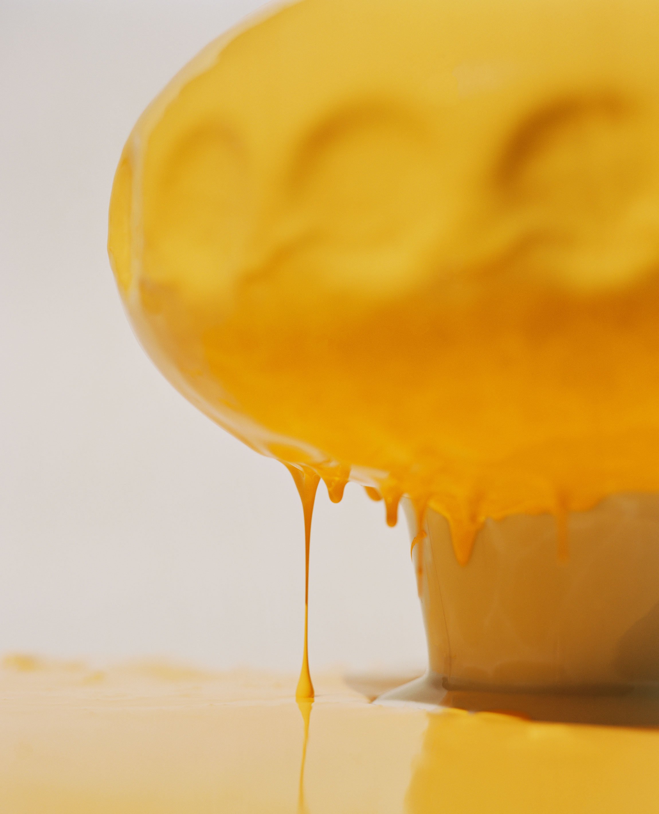
The early 1970s were the heyday of science fiction culture and ufo forms became increasingly popular. Probably best known is Matti Suuronen’s ellipsoidal roundhouse made largely of plastic. But designers of everyday objects were also finding increasing appeal in the design of flying spaceships. The spirit of the Space Age is colorful, flashy and loud. Bright orange tones, different gradations of yellow, squeaky apple green, ocher and brown tones dominated mainly in this design wave. In this decade, the most style-influencing color is an apricot-orange, a shade that can also be found in the color range of Caparol Icons. NO 100 Psychedelic now wraps a vase from the 1970s in a space age look. The choice was made for the yellowish color, which, like all Caparol Icons colors, is free of solvents, plasticizers, emissions and heavy metals. A paint that elegantly represents the movement and perfectly accentuates the shape of the vase.
1980s—NO 93 TRIAL & ERROR
MEMPHIS DESIGN
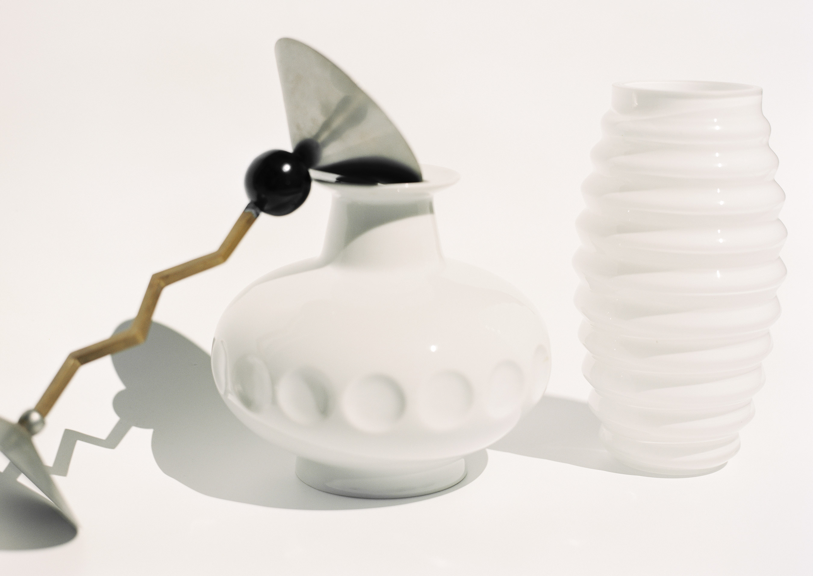
The 1980s, a decade full of euphoric atmosphere and new horizons of design. Memphis, a group founded in 1981 by Italian designers and artists around Ettore Sottsass, pointed in a very different design direction. The focus is clearly on colors—bright neon and also pastel colors. But the shapes have also changed fundamentally—geometric shapes and concise, repeating patterns as well as daring material and color combinations are in the spotlight. In addition, there is a cheerful, light-hearted approach to decor and ornament. Beyond all theoretical superstructure, Memphis is associated with a return to creative, fun-loving design that elevated artistic spontaneity and individuality above all industrial standards of practicality and functionality. The typical Memphis product is characterized by a heterogeneous composition of single, individually shaped elements.
The result is not a closed overall shape, but a strongly contrasting conglomerate of shapes, colors and materials. A beautiful and style defining example of this is the Zig Zag candlestick—an object whose geometric elements are connected by a fragmented line. An expressive gesture of a cone, a sphere, a zigzag line and a round pedestal. The object was dipped in the color NO 93 Trial & Error. A radiant mimosa yellow, entirely in line with the loud look of the 1980s. And a perfect example that shows the innovative formula of Caparol Icons colors, which gives a special depth of color to all 120 shades. A colorful expression of the revolutionary direction of the Memphis movement. Daring, bright and energetic.
1990s—NO 86 POOCH
MINIMALISM
After decades of excess, the 1990s brought us a fresh, clean aesthetic. In terms of cultural history, the period saw the development of a true Minimalism movement. In the realm of fashion, new pieces were based on masterful construction and techniques, portraying unpretentious ease and confidence. The fashion of the 1990s was original, desirable and wearable. However, there was also an increasing desire for clean purism in interior and product design. In contrast to the 1980s, entire rooms were now kept in light colors. Pastel colors but also a lot of white and beige were applied in complete room concepts.
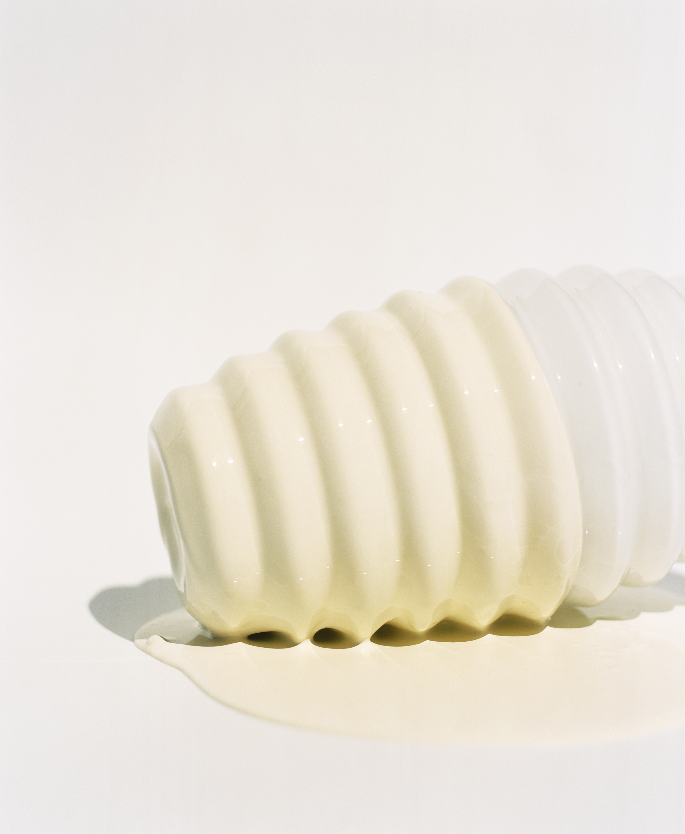
Representative of this decade is a white Swedish vase from the early 1990s made of opaline glass. Covered in NO 86 Pooch, a purist alabaster white. A pale shade that is representative of the minimalism movement’s reduction of things. So clear and pure that it also stands as an example of the sustainability aspect of Caparol Icons, whose entire range of interior paints and varnishes is water-based. Made on demand, the paints are produced with the company’s own spring water at the CO2-neutral company headquarters in the Odenwald region.
in partnership with CAPAROL ICONS