ICONIC COLORS
OF THE 1970S
A tribute to the color codes of the 1970s
— a production of artworks with CAPAROL ICONS
ANZEIGE
This article is part of a paid partnership with Caparol Icons
Shot on 35mm and medium format film
March 2021
Colors are part of our sense of living. We often associate colors with certain feelings and our memories. Through colors specifc emotions can be aroused – we feel reminded of something or are even moved back in time. Even if we have not experienced a decade, a place or a time, colors can evoke a feeling of a certain era.
CAPAROL ICONS looked into this exact subject. How can the story of colors be told again? Together with trend researchers, art historians, interior designers and colorists, the brand dedicated itself to a study on the theme of zeitgeist and spatial culture. They dealt with cultural and social themes such as art, architecture, design, literature, among others. But also people, ideas and revolutions of the time – everything which gave our collective color culture its many identities. The result: 120 modern and elegant color icons. Inspired by the decades from the 1950s – 2000s.
Each individual shade is a tribute to our time – I chose the 1970s. A decade I did not experience myself, but hardly any other period fascinates me as much as this era. It’s the dynamic, boundless spirit of optimism. The architecture, art and design. The whole visual design language of the 1970s seemed revolutionary and inspires me in many aspects of my life. This can be a piece of furniture, a typeface, a magazine, as well as a certain song or, of course, a color.
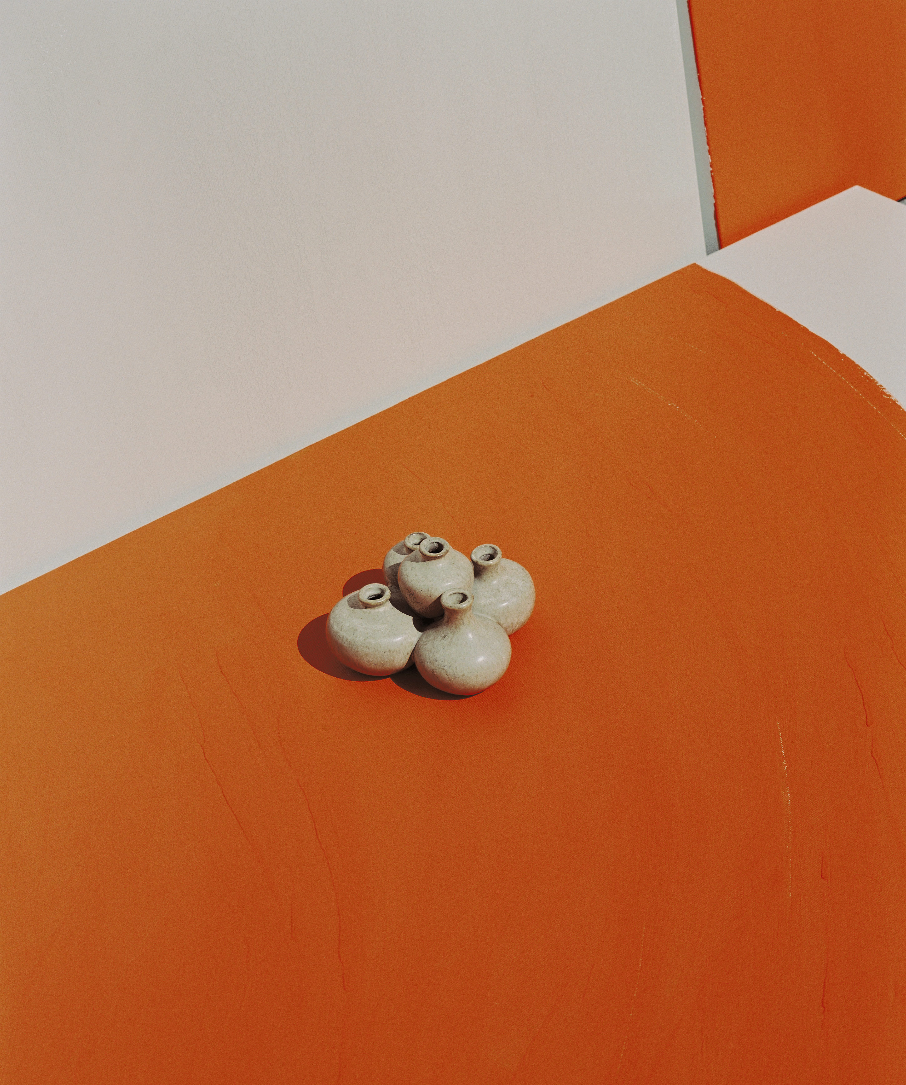
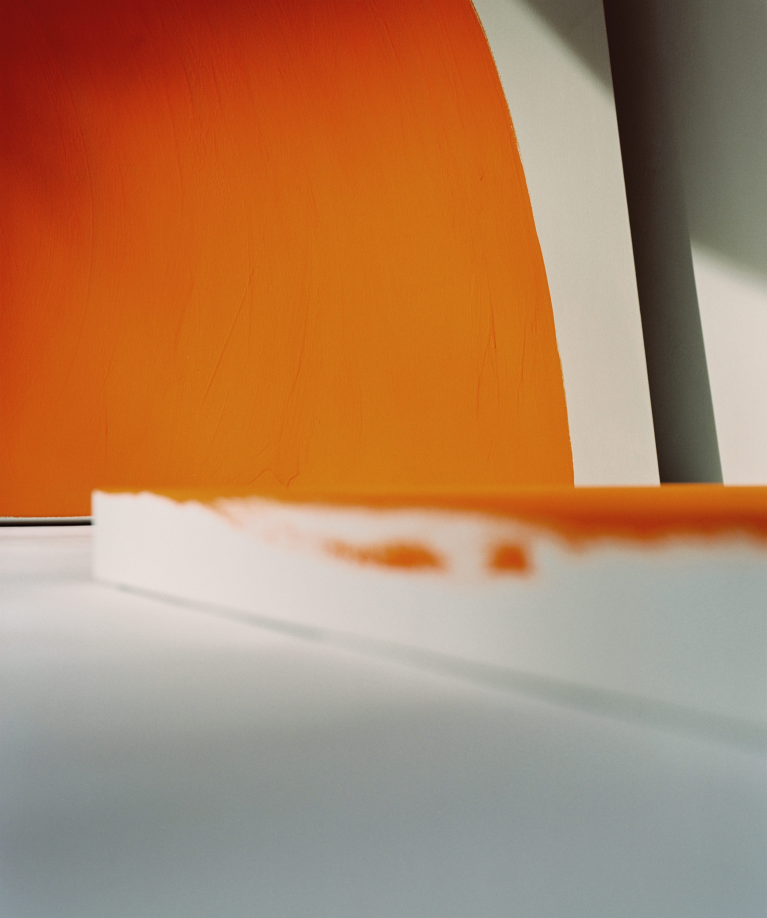
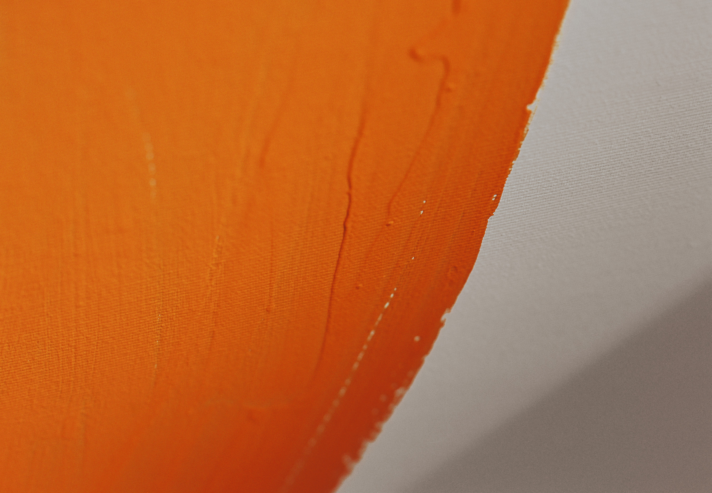
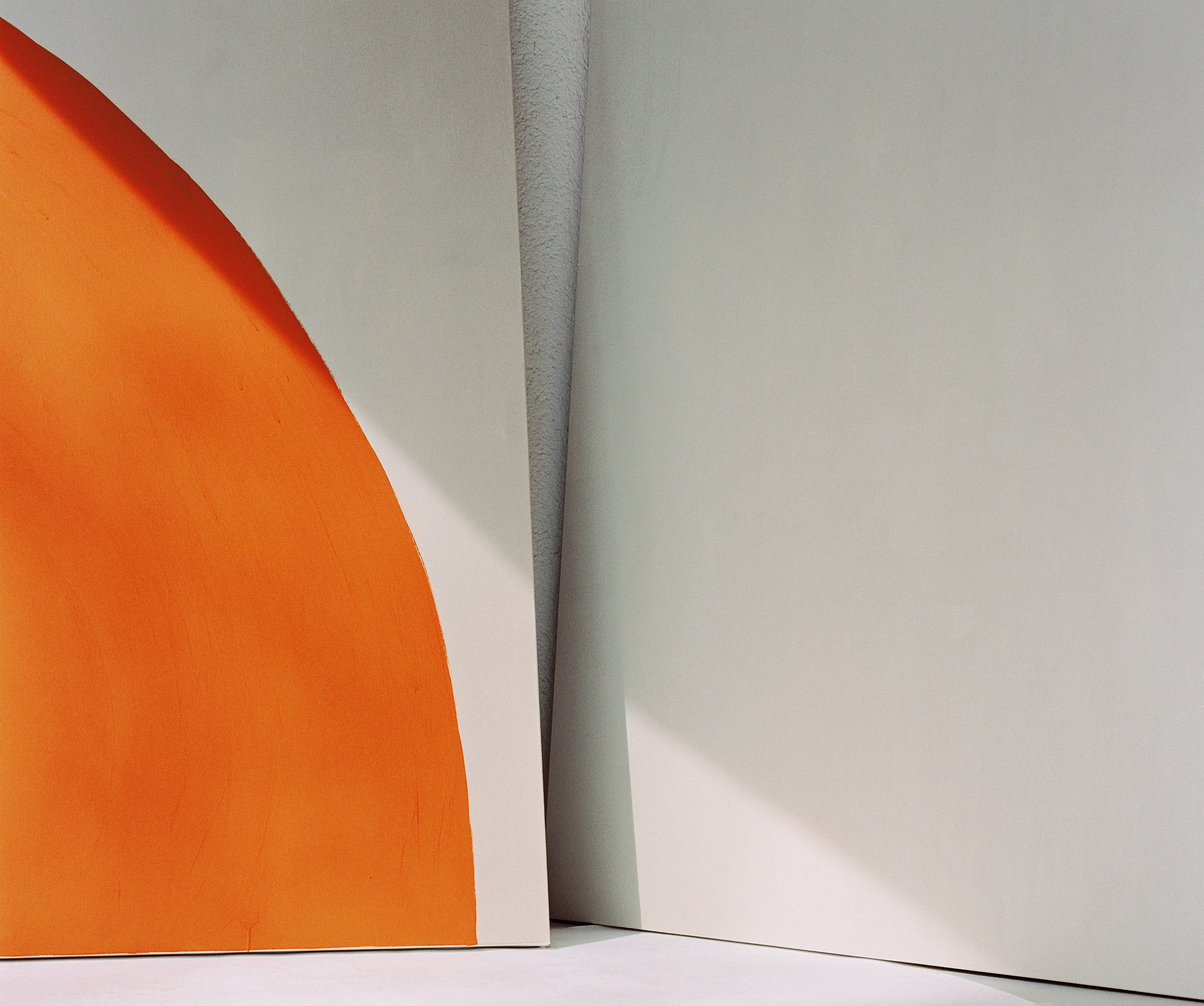
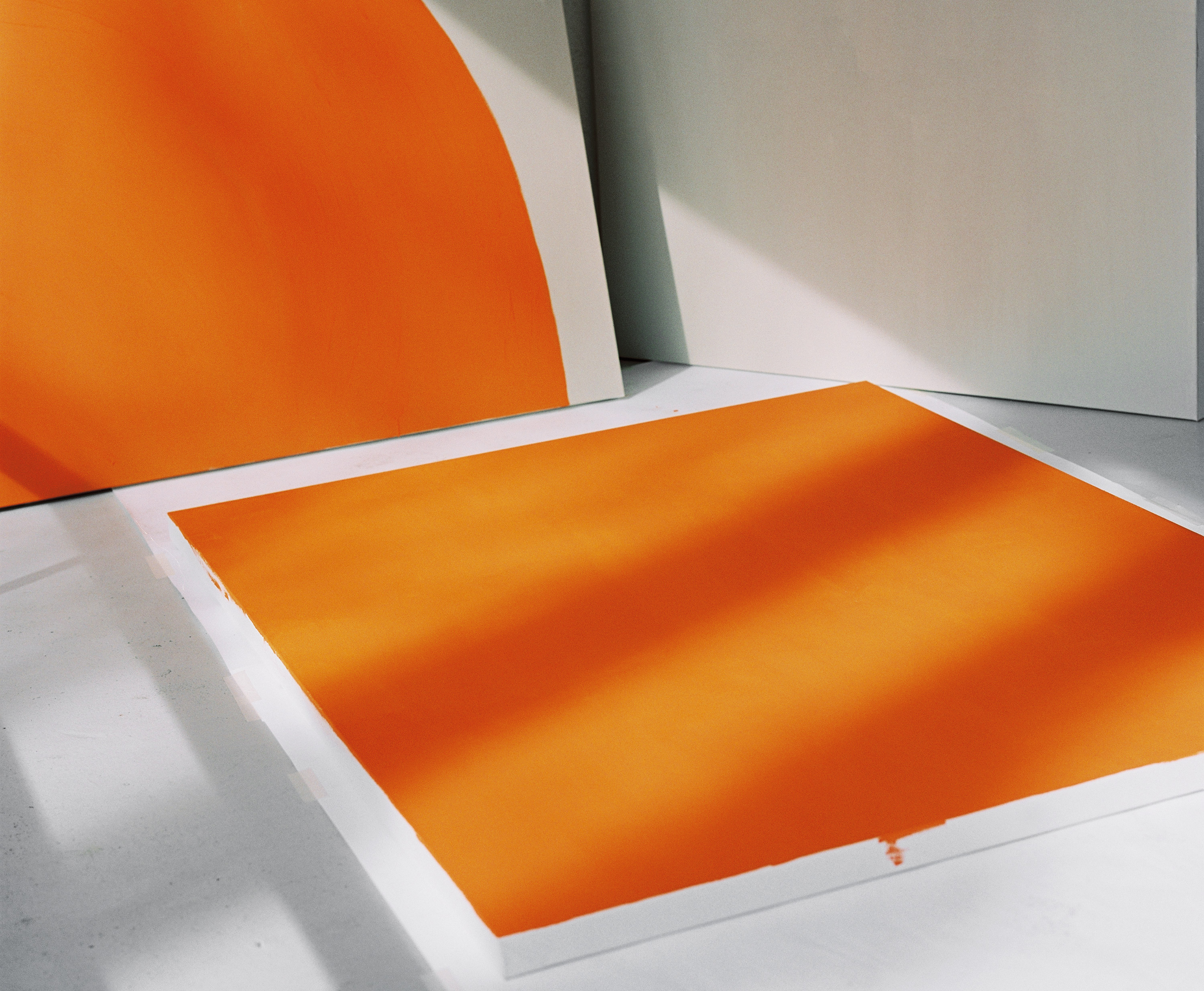
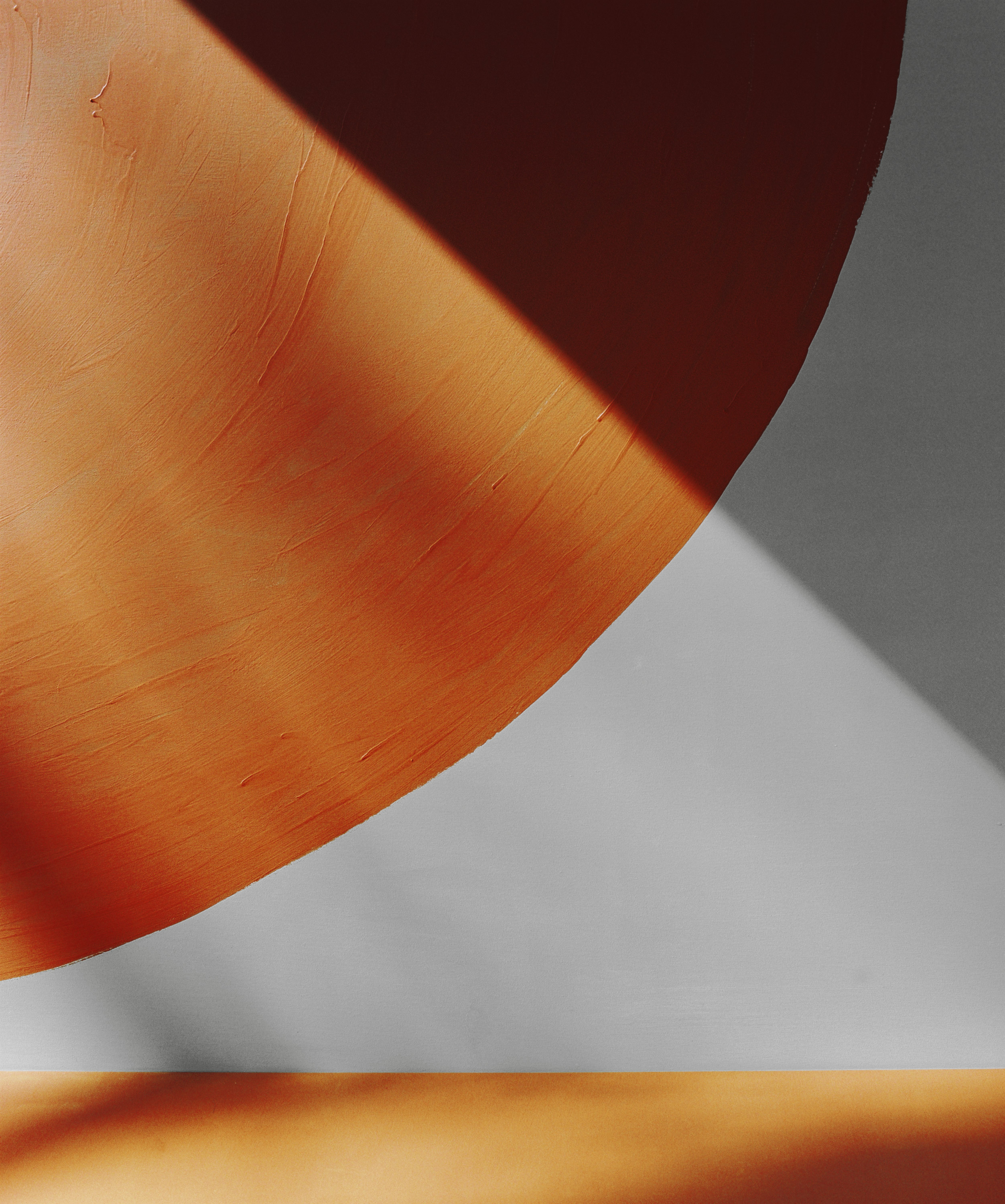
The color spectrum of the 1970s is wide – bright colors like orange, yellow and apple green were very common. But also muted and neutral colors, such as different shades of brown, beige and gray. I usually like it plain and simple but I decided that it would be nice to underline my understated interior design with a pop of color. For this project, I chose to collaborate with the wall paint manufacturer CAPAROL ICONS to create three pieces of art. The result is a triptych which is now decorating my living room.
The color spectrum of the 1970s is wide – bright colors like orange, yellow and apple green were very common. But also muted and neutral colors, such as different shades of brown, beige and gray.
POONA
When looking closely at the colors of this decade, I decided to work exactly with these contrasts.
A reference that could not be more suited to the zeitgeist of that era. One color is soft and bright, the other one strong and eye-catching. I chose to work with NO 29 BOOGALOO – a light brown, suede tone. Neutral, calm and pleasant. In contrast to this is NO 110 POONA – a gaudy, warm and vibrant shade. Even more fascinating are the inspirations for each individual color.
BOOGALOO is based on the light brown buffalo leather of the congas used by New York jazz musician and percussionist Ray Barretto. He was considered a virtuoso on the congas, mixing Afro-Caribbean rhythms with various jazz influences on this hand drums. Just like his music, BOOGALOO is a fusion of Soul, Rhythm & Blues and the Cuban music genre Son Cubano.
POONA takes us to the city of the same name in India. It is a fiery curry tone – warm and optimistic. Inspired by the famous celebrity ashram in Poona, which caused a sensation in the 1970s, POONA is also a reference to the flower ‘Indian Marigold’, which is associated with the sun in Indian culture.
Colors are part of our sense of living. We often associate colors with certain feelings and our memories. Through colors specifc emotions can be aroused – we feel reminded of something or are even moved back in time. Even if we have not experienced a decade, a place or a time, colors can evoke a feeling of a certain era.
CAPAROL ICONS is a luxury paint manufacturer. The 120 curated shades of the collection were inspired by six decades of color culture – from the 1950s to 2000s. They interpret iconic moments of color culture and give a unique flair to the most refined interiors by creating exquisite, luxurious walls. The curators’ ambition was to create a classic collection that would meet the needs of a wide variety of home designs and lighting conditions, and whose colors would be easy to combine.
The paint combines an environmentally and health-friendly formulation with a unique color concept: water-based, odorless, emission-minimized and free of solvents, plasticizer and heavy metals. The intense luminosity and depth of the colors comes from a very high pigment percentage, which is up to 100% higher than that of conventional paints. CAPAROL ICONS is produced in Germany in the highest manufacturing quality.